
Anyone who does not believe in climate change should find another planet to live on. Our favourite planet, Earth, is four billion years old and the climate has gone through huge changes over that time. Curiosity about the actual climate change in our area and its possible effects on how we grow crops led me to assemble actual weather and climate data, which I’ve shared with readers. The project has been going on for a decade.
Climate and weather
Weather is the month-to-month, year-to-year fluctuations we experience. All agree that climate is the 30-year average of the weather conditions observed. Therefore, if we want to know how climate is changing, we must plot the 30-year moving average over as long a period as possible.
Read Also
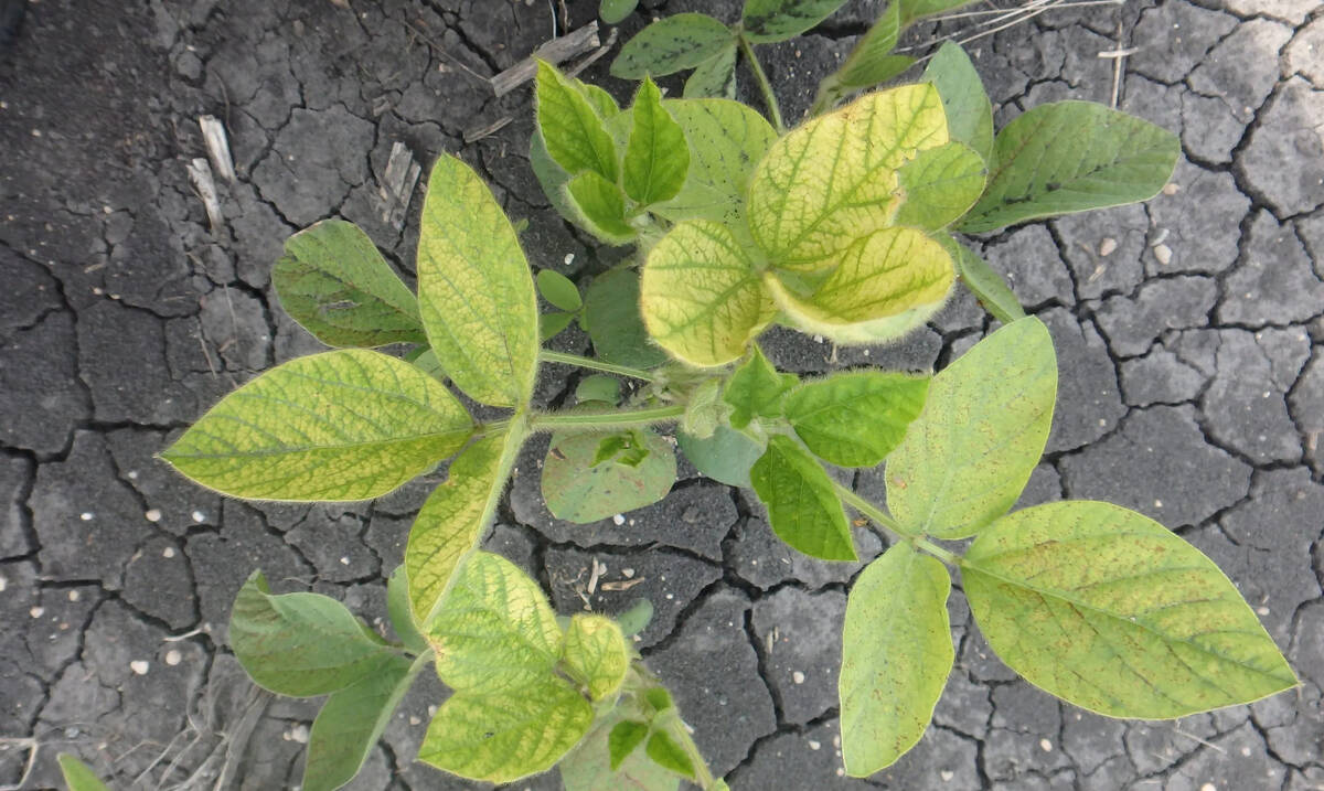
Selecting IDC-tolerant soybeans doesn’t reduce yield, Manitoba study confirms
University of Manitoba research shows soybean varieties selected for iron deficiency chlorosis (IDC) tolerance protect yield in affected areas without reducing performance elsewhere in the field.
We have assembled monthly temperature and precipitation data for the Swift Current, Sask., station with data back to 1886, plus other stations with records that long or longer from adjacent U.S. states.
Regular readers will remember columns in January and March 2020 dealing with monthly temperature plotted as a moving 30-year average. That actual data led to the following observations:
- January, February and March have a temperature range of 5+ C and that large range drives the annual temperature.
- January to March climate cooled from around the 1940s to the 1970s, then warmed sharply from about the 1970s to 2000. The current warming trend ended around the turn of the century.
- July climate is actually cooler now than it was prior to 1965.
- The 30-year average temperature for September has risen from about 2000 to 2015.
- Other months have not changed much.
There is a very good reason for using monthly temperatures. There is also a very good reason we have 12 months in a year instead of 10. The 12 months correspond to the travel path of that beautiful white sphere that appears each night and changes as the month progresses.
Precipitation
This piece will show actual precipitation data for Swift Current, Sask., and Fargo, N.D. Total annual precipitation and the five- and 30-year moving average graphs are provided.
The Fargo record goes back to 1875, so when comparing graphs be sure to compare the same years. The extra 11 years was very useful. It showed a wetter climate in the period before the Swift Current record. To be honest, when I first plotted the 30-year moving average, I did not know what to make of the overall U-shaped curve.

I leave readers to draw their own conclusions, but I have made the following observations:
1. Weather: The annual precipitation graphs show a few years with exceptional highs and a few exceptional lows, but no definite pattern over time.
2. Five-year moving average: This is probably the most significant in terms of growing crops. The 1930s, early 1960s, late 1980s and early 1990s are low points at both stations, but our 2001/02 drought was a high rain period for the five-year average at Fargo. The longer record at Fargo (back to 1875) showed wet conditions before our land was settled.
3. Climate: The 30-year moving average precipitation data shows a very distinctive U-shaped pattern. The longer record at Fargo reinforces the wetter climate in the early days of farming on the Canadian Prairies. Please note the different precipitation ranges for the two stations — 80 millimetres for Swift Current but 140 millimetres for Fargo.

When I first looked at that graph, I really did not know what to make of it. However, it is the actual climate data. It shows over the farming period since the sod was broken, we had it good until the Dirty Thirties, have been bouncing along the bottom for almost all of my active years at the University of Saskatchewan, and are now on the gravy train. When the gravy train will end is anyone’s guess.
The 10,000-year record of climate change is written in the soil profile with soil organic matter and depth of topsoil as key determinants. Soil climatic indices of temperature and precipitation combined have been derived to put a specific number on a distinct soil climatic zone. When I apply that soil climatic index to the Swift Current data, I see the same U-shaped curve.
The bottom line
Based on the data assembled, the climate change happening in our area of interest is nothing but good news — it’s wetter and with temperature little changed in the months that really matter. July is the key temperature month for canola and it is a bit cooler. We must not ignore the big bonus to crop production from Mother Nature, with higher CO2 in the atmosphere.
If we are talking about adapting to the new climate we must have some actual climate facts to know what we are adapting to.